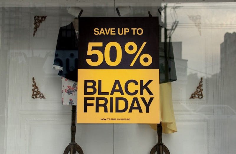
More than half (55%) of Filipino adults will shop online on Black Friday but over 20% of adults say it would take a discount of 90% for them to make a purchase! Meanwhile, 11% say 50% off is the magic number.
On Black Friday, all online sellers discount and the lowest price is not a competitive advantage. So how to meet shoppers’ expectations and compete with other ecommerce merchants?
The answer is to make shopping online more enjoyable, and make it easy for shoppers find what they really want. Is your website ready?
Cross-sell more with 1-to-1 personalized recommendations
Upgrading your website with recommenders that nurture your online shoppers like an attentive sales person should be priority number one.
The massive success of the biggest online marketplaces like Amazon, Shopee and Lazada all do it, why wouldn’t you?
Just getting the recommender on your site empowers your sales funnel with AI-visual recognition that “sees” what shoppers are browsing and then knows what to recommend.
The AI finds out what shoppers want, enhances the quality of your product tags and improves merchandising across all pages of your website.
On your product details page, for example, using personalization to engage customers can boost AOV 2.5x!
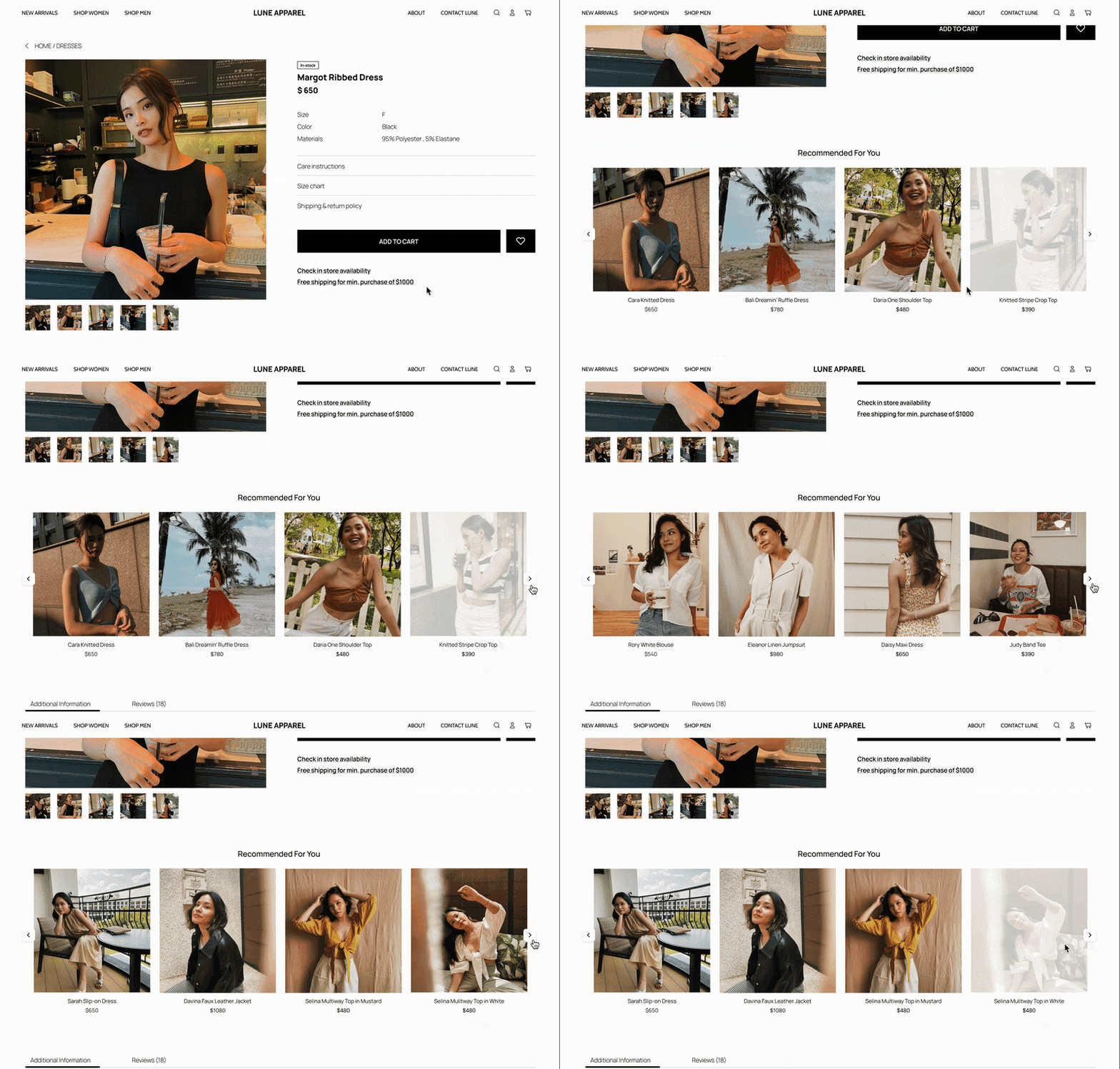
These days you can subscribe to an affordable plugin (as low as 89 USD per month) that can be set up on your site in less than an hour.
The Rosetta AI Personalization Platform offers 7 recommender types with algorithms custom made for fashion-related websites selling apparel, cosmetics and accessories. Sign up and try it for FREE for 30 days.
Convert more promotions with AI-driven popups
Smart promotional popup plugins can figure out the best time to show your best deals. Timing matters, and over with over 5 years of testing behind it, Rosetta AI machine learning can understand your shopper’s tendencies within just a handful of onsite clicks.
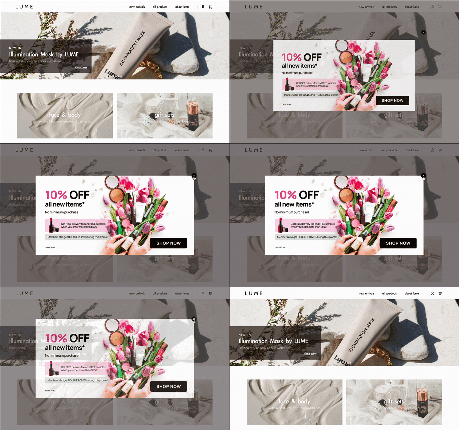
For returning visitors, the timing gets even more accurate thanks to the industry-leading Hesitant Customer Detection feature, which shows what shoppers just what they want to see, at just the right moment.
Keep collections creative, leverage community
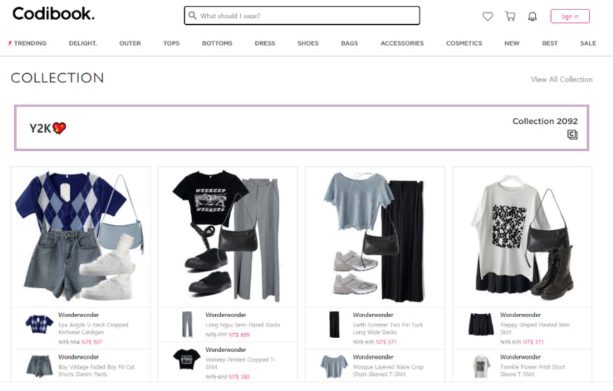
You can get creative with a collection theme. Vintage is trending again? Ok. Here’s the vintage collection. In fact here’s a particular vintage, Y2K:
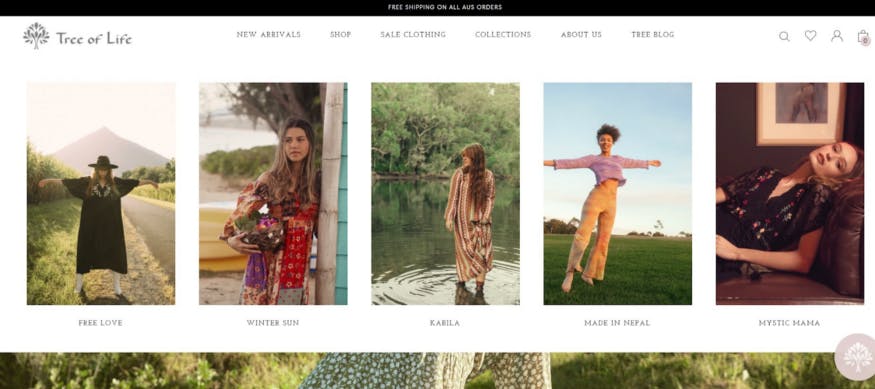
Collections can be themed in a way that communicates your brand values. Australian BOHO brand Tree of life offers collections ranging from “Free Love” to “Mystic Mama.”
Collections can also be user generated. Many brands have membership programs that reward frequent consumers with discounts and exclusive offers, etc., but nowadays brands even get their community to design collections.
Korean multi-brand fashion powerhouse, Codibook, is known for its shopping community of over 800000 “Coordinators,” who create their favorite outfits from an assortment of products from over 70 different brands.
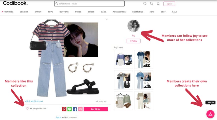
Then they share their creations as shoppable outfits for other users to see. Great outfits are promoted as collections on the website and are rewarded with giveaways, encouraging customer engagement and attracting new users all the time.
Making collections is a great merchandising tactic that eases the customer journey by offering a suggestion and removing difficult decisions.
Collections are easy to set up if your product tags are set up well.
Instead of having someone choose each item to show, you can update a whole group of products based on attributes you want to focus on (price, gender, color, fit, sleeve, neck, etc.).
Embed shoppable UGC (user-generated content)
Besides collections, you can invite your visitors to provide content for you that shows off your brand out in the wild.
A UGC feed from social media on your landing page provides a valuable layer of authenticity to your brand.
Seeing how clothes look in real life (at the park, on the street, at work, etc.) provides social proof that people love your brand, and heightens your trustworthiness, increasing the shopper’s comfort and the likelihood they will complete their purchase.
Making the UGC image shoppable (checkout just a click away) increases the likelihood of conversion even more.
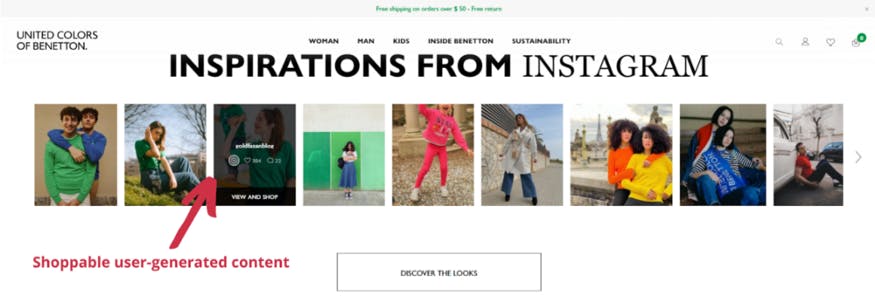
United Colors of Benetton worked with Photoslurp to embed a UGC feed on the homepage shown above. On average, Photoslurp can increase sales by 15%.
While UGC provides the third party authenticity, you can also opt to show off your own IG content to merchandise products.
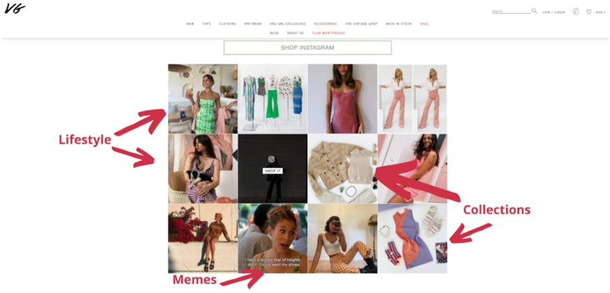
The familiar grid layout feels natural to shoppers whose browsing time is primarily spent on Instagram. You can control your content to include memes, collections, influencers, settings, and really whatever you post on your Instagram is fair game. Verge Girl has it figured out:
Product reviews are another form of UGC. They convert best when they’re shoppable (with Buy Now or Add To Cart just a click away)

Stay relevant with your product imagery
While luxury brands struggle with the predicament of how to remain exclusive and still be relatable online, they are the minority!
For most brands, ultra-realistic, everyday-looking product imagery is what sells these days because it’s what people are used to seeing from influencers, friends, family, work, hobbies, entertainment, news, etc.
Instagram image trends in 2021 gathered by WGSN (12 trends in total) include “less filtered perfection as new pandemic-era content places an emphasis on unfiltered perspectives.”

Beyond the filter. Over the past year, Instagram influencers began to develop content that reflected emotionally turbulent times (Source: WGSN).

Messy bedrooms. As the world locked down in 2020, the culture of Instagram changed almost overnight (Source: WGSN).
The WGSN Instagram Styling 2021 list goes on, including Blurred Imagery, Purposely Poor Photoshop, Sink Stories, and more.
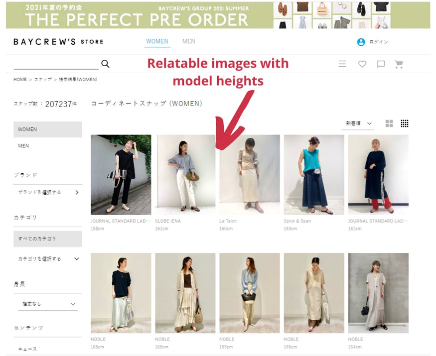
Japanese multi-brand retailer, Baycrew’s, presents professional but low-key imagery. They also add the height of the model to give the shopper a clear reference when choosing the fit.
Shein presents more glamorous models wearing sexier styles, but still keeps imagery relatable in terms of image production value.
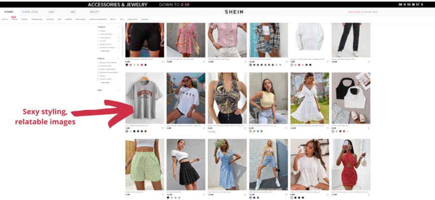
As the Shein example shows, relatable doesn’t have to be dull. It’s what the younger generations (Gen Z, Millennials) expect to see this year.
Present products in the inverted pyramid style
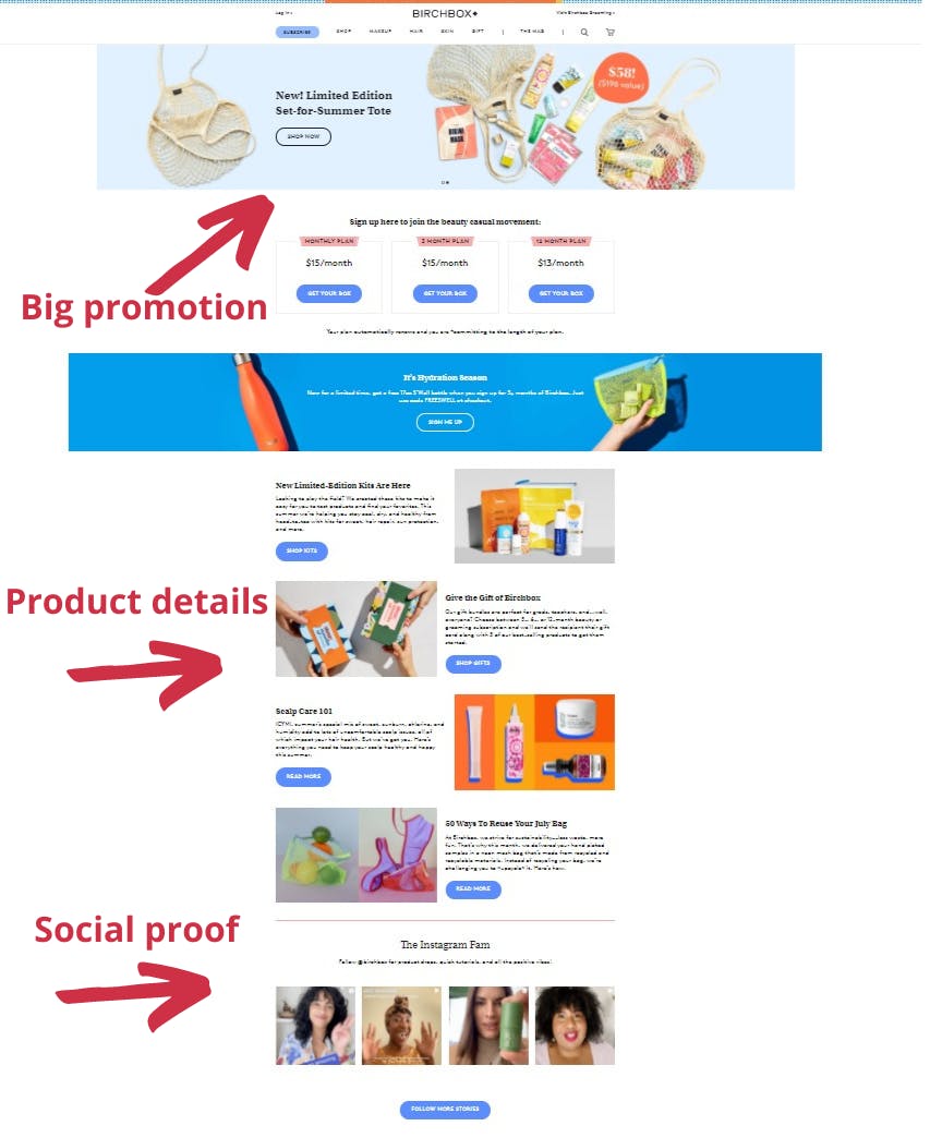
This style of presenting information is a standard in journalism but it also works well for merchandising products because it maps to the classic AIDA marketing strategy (attention, interest, decision, action). In journalism it breaks down like this:
- Most important information first (who, what, where, when, how)
- Important details next
- General/background information last
Birchbox is a good example of the inverted pyramid for ecommerce merchandising:
Make product categories that guide shoppers
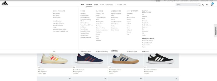
A clear list of categories lets shoppers see your entire product range at a glance. This high level view of what you’re offering is comforting to shoppers because it lets them find what they’re looking for with maximum efficiency.
It’s a very basic thing but, but big brands like Adidas do it well because it makes for very good CX.
Implement detailed faceted search
Faceted search is another way to help your shoppers search for products quickly. It improves the customer experience in the same way that good categories do: by easing the experience.
Being able to search for products by brand, department, size, color, etc., reduces friction and keeps your shoppers shopping.
Popcorn, a multi-brand streetwear ecommerce site from Hong Kong uses faceted search because they have a large inventory of products and brands to choose from.
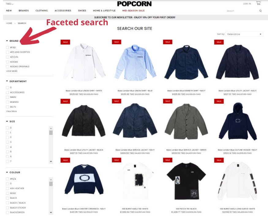
This advanced search option makes it easier for shoppers to find what they’re looking for, increasing CTR and overall conversion.
Reward shoppers who complete the customer journey
How good is the cheap pizza/hotdog at Costco after you’ve made the full trek through the store? That’s their reward to us and we love it!
Ecommerce merchants have figured out plenty of ways to do this as well. The Sephora checkout page has freebies and promotions, encouraging us to keep going at this last stage of the purchase.
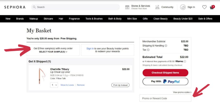
Besides incentivizing us to complete our purchases, this tactic makes us appreciate the offer and that feeling leads to brand loyalty.
More traffic means more abandoned carts, prepare your remarketing/retargeting
A big part of ecommerce merchandising revolves around the opportunities presented when shoppers add to cart but don’t check out, because it happens a lot.
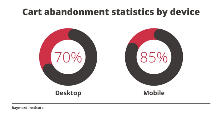
There are actually lots of things you can do to prevent shopping cart abandonment in the first place.
But when it does happen, the best thing to do is to have a well-thought-out recovery plan for Email/SMS remarketing and retargeting ads.
Send personalized remarketing emails
So remarketing emails for cart abandonment convert at a high rate compared to other forms of email outreach.
If you schedule them to be sent right away it’s best, within a couple hours of the cart being abandoned to remind shoppers while the experience is still fresh.
Use SMS remarketing
While email remarketing gets high open and conversion rates, the rates for SMS are super high at 98%.
One reason is that we often see an SMS before an email. When an SMS pops up, we read immediately because it’s so short and usually easy to read in its entirety as a notification.
Pay for retargeting ads
Retargeting ads also work well for recovering abandoned carts. The most effective way to run a campaign is to base it on specific segments.
AI-driven solutions can help identify these segments, right down to their browsing/spending habits and product preferences at the attribute level.
Final thoughts
Ecommerce competition is intense and no more so than on Black Friday. Taking the time to upgrade your website can be a real factor in determining your conversion rate, especially on the biggest online shopping day of the year, when traffic is going to heavy
Great websites put time and effort in to engaging customers, making the shopping experience interesting and guiding them along.
Does your website do that?


